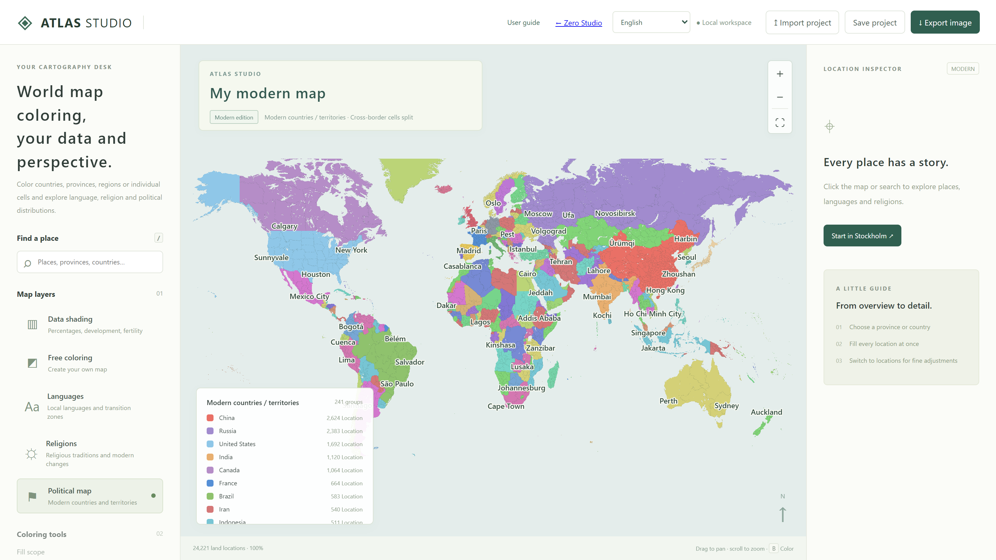
Make your first map
For a first project, try a map of countries you would like to visit. You do not need a spreadsheet or an account.
- Select Free coloring. Choose your working mode in the layers panel on the left.
- Choose how much one click should fill. Set the fill scope to Country / territory.
- Pick a color and click the map. Click a palette color, then a land location in your chosen country. Its constituent locations will be colored together.
- Name the legend category. In My legend, call the color “Planned visits” or another meaningful label.
- Add another group. Choose a different color for other countries, such as those you have already visited.
- Set the title and framing. Edit the title above the map, then use Export image to download a PNG.
If you make a mistake, Undo returns to the previous painting operation. Start with a small area, then expand once the tools and legend feel familiar.
Open the free coloring workspaceTools and geographic levels
The left panel controls how you draw, the center displays your map, and the right panel describes the selected place. Drag to pan; use the mouse wheel or the plus and minus buttons to zoom. Fit world returns to the world view. Search for a place and select a result to locate a city, region or country.
| Layer | Suitable uses | How to work |
|---|---|---|
| Free coloring | Groups, itineraries, imagined settings and your own regional classifications. | Select a color and scope, then click land. |
| Data coloring | Comparable numbers such as percentages, indices and fertility rates. | Set units and a scale; enter values or import CSV. |
| Languages | Local languages and mixed transition zones. | Inspect locations and focus a legend category. |
| Religions | Religious classifications and areas of coexistence. | Inspect a place and compare nearby areas. |
| Political map | Country and territory assignments. | Inspect country membership and show borders. |
Province and region are working scales
From small to large, the hierarchy is location → province → region → country / territory. A location is the smallest selectable cell; provinces contain locations; regions combine larger geographic areas. In China, provinces in this tool mainly correspond to prefecture-level units, while regions approximate historical or natural geographic areas. Japanese regions broadly follow areas such as Hokkaido and Kanto. Some small countries form one region.
These are shared editing levels across countries, rather than identical legal administrative systems. Use Inspect on a cell and read its country, province and region assignments to check the actual grouping.
Border display and fill scope are separate
Border level changes the lines you see. Fill scope changes how many locations one painting action affects. You can show every individual cell boundary while filling an entire country in one click. Changing border visibility does not change existing colors.
Color a whole region, then refine individual locations
Painting every cell separately takes time. A practical approach is to establish a broad area first, then draw the exceptions.
- Select Free coloring and set the fill scope to Province or Region.
- Choose a palette or custom color, and select the Paint tool.
- Click one land location in the target area. All locations in that province or region will receive the color.
- Return to Location, choose another color, and click the cells that need a different category.
- Use Inspect to check the result; zoom or change the border display when needed.
The province action establishes a shared base. Location mode changes only the cell you click. Order matters: painting the entire province again will also overwrite its local exceptions.
Fill an inspected area from the right panel
Inspect a location, then choose a province, region or country in the summary/fill scope control on the right. Check its location count before using Fill with current color. On the public site, custom painting from a built-in classification layer switches to the free coloring result.
Erase, undo and redo
Erase removes custom colors at the selected scope. With Region selected, it removes that region’s custom painting. Undo and Redo apply to free coloring operations; Clear removes the custom painting. Edit numerical tables through the numerical fields or CSV, rather than relying on painting undo to reverse an import.
Use the eyedropper and two-color stripes
The Eyedropper lets you reuse existing colors. Select it and click a colored cell to pick its main color. A striped cell also supplies its second color. Choose your next fill scope and continue painting other cells.
To borrow colors from a language or religion map, view that layer before sampling a location. On the public site, subsequent custom painting uses Free coloring; you can still return to the built-in layer to view it.
- Choose the main color in Free coloring.
- Enable the two-color stripe option for mixed transition zones.
- Choose the second color and check the preview for a clear difference.
- Paint the mixed areas using a province, region or location scope.
- Name the pair in the legend, for example “Two categories coexist.” Turn stripes off when you return to single-color areas.
One category you have defined.
Coexistence or transition, without a population share.
A value mapped to common scale limits.
The width and area of the stripes are a drawing style. Two colors do not mean 50% each. To show “35% use a language,” enter 35 in Data coloring instead of estimating a share from stripes.
How values, percentages and color depth relate
In Data coloring, choose the table’s geographic level, unit, minimum and maximum first. The map calculates each region’s color using the same scale. Values nearer the maximum receive colors nearer the high-value end.
| Indicator | Unit | Range | Example input |
|---|---|---|---|
| Share | % | 0 to 100 | For 35%, enter 35. CSV also accepts 35%. |
| Development index | Index | 0 to 1 | Enter 0.78 as 0.78. |
| Total fertility rate | Children per woman | For example, 0 to 5 | Enter 1.6 as 1.6; do not multiply by 100. |
With a percentage unit, 35 means 35%; 0.35 is displayed as 0.35%. A unit is descriptive text, and does not automatically convert a decimal fraction into a percentage. Use consistent definitions for indices and fertility rates, too.
Enter a few values directly on the map
- Choose the Table geographic level, such as Country / territory.
- Select a land location on the map or in the search results.
- Enter a number in the Value section at the top of the right panel and click Apply value.
- Continue with the next area. At country level, any constituent location edits the same country value.
Move the slider to see a number become a color
This demonstration uses the same calculation as the map. It does not edit your map or save its values.
Zero, missing data and values outside the range
0 is a valid value and receives its scale color. A blank entry is missing data and uses the Missing color. To remove a value, clear the field on the right and apply it. Numbers above the maximum or below the minimum remain saved, but their colors stop at the endpoints. With a 0–100 scale, 110 and 100 therefore share the high-value color.
Changing the limits changes visual emphasis. When comparing two years, use the same units and limits. A color on a 0–100 map cannot be compared directly with that color on a 30–60 map.
Choose among the three numerical color modes
Single-color shading: compare one indicator
Set the Low color, High color and Missing color. A shared scale suits percentages and development indices. A light low end and a darker high end of the same hue usually make the ordering easy to read.
Different base colors by region: retain groups and values
Select Different base colors by region in Color mode. Add colors through the palette or Add color, choose a base color and click the map to assign it to a region at the current table level. The existing value stays the same. You can also change a selected region’s base color in the right panel.
For example, make group A blue and group B green, using a 0–100 scale for both. High values approach each region’s base color; low values approach the shared low color. Different hues can appear differently bright, so consult the numbers and legend when comparing groups.
Multicolor gradient: emphasize value bands
Select the whole-map multicolor gradient and use Add gradient stop for intermediate colors. A stop’s position is a percentage of the scale range, rather than a percentage in your data: on a 0–5 scale, the 50% stop means 2.5. It means a value of 50 only on a 0–100 scale.
The 0% and 100% endpoints remain present. Intermediate stops can be moved, recolored or removed. Choose a clear color sequence and explain the indicator in the title and legend; red and green need not imply “bad” and “good.”
Enter many values with Excel or CSV
For many areas, a table is easier than clicking each region. Select the correct Table geographic level and use Download template. The template lists the available areas at that level. A country template cannot be imported directly at province or region level.
| Column | Purpose | What to edit |
|---|---|---|
key | The stable matching key. | Keep it to identify the region. |
name | A human-readable name. | Optional; changing it does not change matching. |
value | The number to map. | Enter a number; leave missing values blank. |
color | An optional regional base color. | A six-digit hex code such as #498dcc, or blank. |
key,name,value,color
FR,France (example),35,#498dcc
JP,Japan (example),65,#db7373
GB,United Kingdom (example),0,
BR,Brazil (example), ,
These are practice values, not actual country statistics. Download the practice CSV and import it at Country / territory level with % as the unit. Compare 35, 65, 0 and a blank. The sample contains four countries; other areas will show missing data.
- Open the template in Excel or another spreadsheet, edit
value, and optionally addcolor. - Save as CSV UTF-8, keeping the column names. Tab-separated TSV also works.
- Return to the same table level, set the unit and limits, and select the file through Import table.
- Read the import count and any out-of-range warning, then inspect a few regions.
- Use Export table to download a CSV containing your current values and base colors.
Export the current table or save the complete project before importing a new one. Duplicate or unknown keys, nonnumeric values and invalid colors are rejected. A rejected table is not applied partially. The limit per import is 10 MB.
Values at different geographic levels are stored separately. Changing from countries to provinces does not distribute country values equally among provinces, or sum provincial percentages into a national percentage. Supply data appropriate to each level.
Save an editable project and export images
Ordinary editing is saved in the current browser. This is convenient local storage: another browser or device does not automatically receive your project, and clearing site data can remove it. Use Save project at the top right for a lasting backup.
| Format | Includes | Best for |
|---|---|---|
| JSON project | Custom painting, legend, title and numerical settings at each level. | Backups and continuing in another browser. |
| CSV table | Keys, names, values and base colors at the current table level. | Editing numbers in a spreadsheet. |
| PNG image | The current map view, title and complete legend. | Reports, lessons, articles and sharing. |
Before exporting an image, adjust the title, zoom and label display so your subject fills enough of the view. A PNG can be viewed but cannot restore editable data. Save JSON alongside it if you intend to make changes later.
Import project loads a previously saved JSON. The project checks compatibility with the map data to avoid placing old cell colors on different locations. Units and numerical limits are also saved in the project.
Frequently asked questions
Why did a whole country change when I clicked one cell?
Check the fill scope. Location affects one cell; Country, Region and Province affect all their constituent locations. Undo the painting operation and choose the intended scope.
Why does changing borders not change the fill scope?
Border level is a display setting, while fill scope controls editing. Set the fill scope directly.
Why does percentage coloring use only one hue?
Single-color shading is the default. Choose different base colors by region to assign multiple hues to groups, or the multicolor gradient to use several hues along one numerical scale.
Why do most areas show the missing-data color?
Data coloring shows only the values you have entered. Check the table level, whether CSV keys match, and whether values are blank. Do not replace unknown values with zero.
Does the location count in a language or religion legend mean population?
No. It counts mapped locations containing the category. A coexistence location may count in both categories, and locations have different populations. The count cannot be converted directly into a population share.
Why does painting on a classification map switch to Free coloring?
The public site edits your custom result through Free coloring. Built-in religion and language layers remain available to inspect. For numerical maps, use the Data coloring fields.
Where are the tools on a phone?
On narrow screens, the tools and selected-location details move below the map. Scroll down for layers, scope and colors; the map’s plus and minus buttons control zoom.
When can I use a map for statistical comparison?
Built-in language and religion maps show qualitative distribution and coexistence. For a statistical map, supply comparable values using one year, indicator and geographic level, then explain the definition and year in the title or accompanying text.
Give your observations a clear map.
Start small, check your categories, keep an editable backup, then share your result.
Return to the map workspace