Decide what the map should answer
Begin with a specific question. “Which religious categories appear in this area?” suits a categorical map. “What percentage identified as Catholic in a given year?” needs numerical data. One places categories in space; the other compares values for the same indicator.
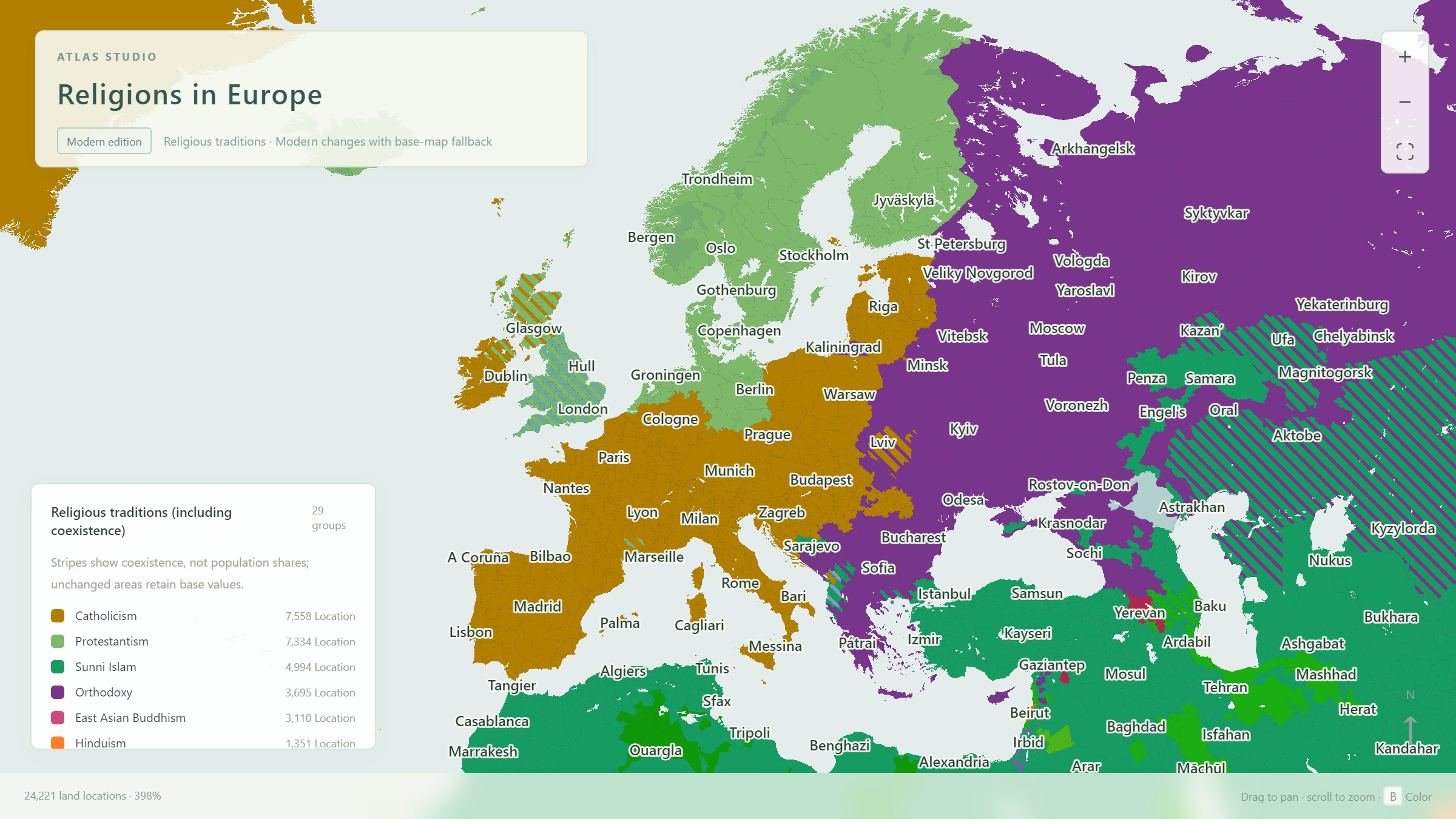
The built-in religion map displays local classifications and coexistence areas for exploration and mapmaking examples. It does not supply comparable contemporary believer percentages for every location. Obtain survey data separately for numerical comparison.
Open the European religion exampleRead the legend before the colors
- Select Religions and show province or region borders to observe broad continuity.
- Read the Religious traditions (including coexistence) legend. Identify categories by name rather than guessing from their hue.
- Inspect a land location and check its name, country, province, region and religious composition.
- Click a legend category to highlight locations containing it. Click again to clear the focus.
For example, the built-in legend combines many Protestant branches into Protestant, while keeping Anglican separate. This helps world-scale reading but reduces denominational detail. Define your own categories before making a finer denominational map.
The legend counts selectable cells, which differ in both area and population. A large colored area does not necessarily contain many believers, while a small city can contain many people. A coexistence location can count in two categories.
A solid color represents the location’s main mapping category; stripes indicate another category’s presence. The main color does not prove a majority in contemporary identification, or that every resident follows that faith.
A European comparison exercise
Open the example and retain the full legend. Inspect Stockholm, London and Paris as three starting points. In this site’s sample, their main categories are Protestant, Anglican and Catholic respectively. This is an exercise in reading the built-in map, rather than a ranking of those cities’ religious populations.
| Observation | What it shows | What to check next |
|---|---|---|
| Zoom into a city | Its current classification and coexistence marking. | Is the cell a city unit or a larger surrounding area? |
| Compare nearby areas | Continuity and transition zones. | Do the locations use consistent classifications? |
| Focus a legend category | Locations containing that category, including striped cells. | The location count does not equal a population share. |
| Switch to the political map | Countries crossed by the same observation area. | Religious patterns do not necessarily follow national borders. |
Next, inspect a striped location. Describe it as “two religious categories are marked here,” rather than “half the people follow each religion.” To investigate a minority religion’s size, check the local survey definitions and year; stripe widths cannot answer that question.
Create your own religious classification map
For a lesson or article, make the categories, areas and legend consistent. Starting with one country or a few neighboring regions is usually easier to verify than starting with the whole world.
- List your categories. Decide whether to distinguish Protestant, Catholic and Anglican, or use broader groups. Categories at comparable levels are easier to interpret.
- Create a palette. In Free coloring, assign each category a distinguishable color and a complete legend name.
- Paint shared areas first. Fill a country, region or province as a base.
- Handle exceptions. Return to Location and adjust places for which you have local information.
- Mark coexistence. Enable two-color stripes using the two categories’ colors, and label the pattern “Coexistence illustration.”
- Export the result. Use a title such as “Religious classifications in [area],” with a period or survey scope where appropriate. Save PNG and JSON.
To reuse a built-in color, sample a location on the religion map with the Eyedropper, then continue your custom work in Free coloring. The palette stays consistent while you choose the classification detail needed for your article.
Province and region scopes speed up painting, but local boundaries and coexistence may still need cell-level adjustments. The presence of a religion in one location alone is not grounds for assigning it to the whole province.
Use numerical coloring when you have percentages
If one survey supplies Catholic identification percentages for different areas, make a map titled “Catholic identification, [year].” Comparing one indicator at a time is clearer than squeezing several religions’ percentages into one cell color.
- Check the denominator: total population, respondents, adults, or those reporting any religious identification. Keep it consistent across areas.
- Select Data coloring and the geographic level corresponding to the data. Put country data at country level.
- Set the unit to %, the minimum to 0 and maximum to 100, and choose single-color shading.
- Enter values in the matching CSV template; leave areas without survey data blank.
- State the category, year and percentage definition in the title, then inspect a few known values.
Enter 35 and 65 on a percentage scale to obtain different shades. These are hypothetical teaching values. Do not calculate them by dividing a built-in religion category’s location count by the total number of locations.
Save comparisons of multiple religions as separate projects or tables, using the same year and scale. Surveys allowing multiple answers can yield overlapping shares. Whether categories sum to 100% depends on the survey, not on the map.
Read the numerical coloring and CSV tutorial →Check what readers can understand before sharing
Readers need to know whether your map classifies traditions or reports survey percentages, which geographic level it uses, and what its stripes mean. Explain these in the title, legend or accompanying text.
- Use clear category names and avoid implying merit through colors.
- Label stripes “Coexistence illustration, not population shares.”
- For numerical maps, state the year, unit, denominator and scale.
- Show unknown values as missing data, rather than zero.
- Frame the relevant area and save JSON for later revisions.
Religious identity and local practice take different forms. The map helps pose questions and explain geographic patterns; actual percentages and local differences require corresponding data.
Give your observations a clear map.
Start small, check your categories, keep an editable backup, then share your result.
Return to the map workspace